How to Make an Effective PowerPoint Presentation
Considering the times of pandemic, online teaching is in trend. Dr.NayanBheda conducted hands-on training workshop on ‘How to Make an Effective PowerPoint Presentation’ for teachers. He explained how to enhance the art of audio-visual learning by giving few tricks listed below:
- Choosing right colours: Colours are the first thing that catch hold the attention. It’s necessary to make your presentation visually appealing. It can be done by choosing right colour combination that highlights your text and makes your presentation stand out. After all, plain or dull background is boring, right?
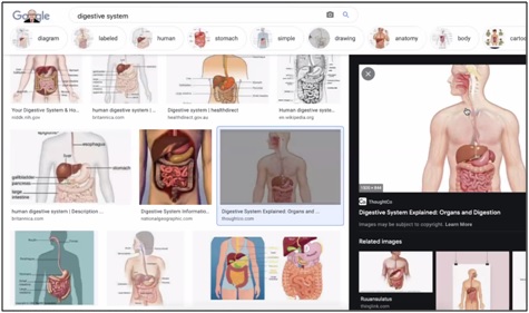
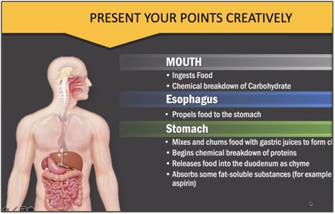
- Appropriate pictures: A picture speaks a thousand words. Rather than writing long paragraph, you can simply add a picture to explain your concept.

- Power of bullets to highlight: A long paragraph in a PowerPoint slide is a big NO! Reduce the information into limited words bullet pointers.

- Don’t use animation unnecessarily: Exaggerated animation distracts the students. However, using it in moderate amount only where it is necessary, can work as a wonder.
- Never read your presentation: The lecture becomes boring as soon as you start reading the presentation word-by-word. Reading out the same words, doesn’t make any sense. Even your students can do it. Rather, you can simply use these pointers for reference and explain them in detail orally.
- Always keep your eye contact with your students: Eye contact is a powerful tool that you can use to maintain the interest of your student. A friendly, cordial eye contact will enhance your communication. It will make your student feel involved, while you talk.
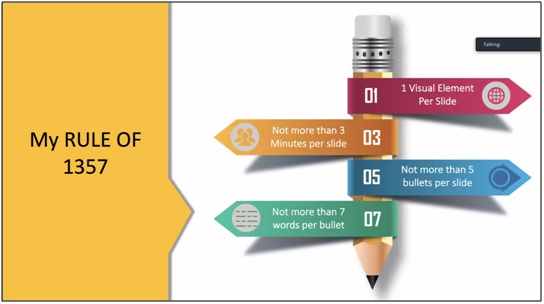
- Rule of 1357 for per slide:According to this rule, there should be 1 visual element, not more than 3 minutes for explanation, 5 bullet pointers and not more than 7 words in a bullet point.

- Consistency is the key: All the slides of your presentation should be in sync with each other. The consistency can be maintained with a common colour tone, pattern and font.
- Use real pictures in your PowerPoint Presentation:Use real pictures in your presentation where ever possible. It will make your students understand how things are in real, rather than just imagining it.
- Always use Sans-Serif font: A sans-serif font is easier to read compared to the Serif font. It can be used for both title and body text in a slide so that the viewer can quickly read the point and return their attention to the speaker.
- Be a storyteller: Mentioning anecdotes or a short scenario related to the topic helps you build the initial interest in your student’s mind.

This insightful webinar was organised by SR Dalvi (I) Foundation and TCHR Talk app, who jointly work for teacher welfare. You can find the recording of this workshop, here
To get an update of such informative sessions, please download TCHR Talk App. It is an exclusive app for teachers.

